Elevate
Elevate is a facilities leaders conference by Trade Press Media Group that aims to help people in the facilities industry elevate to the next level. I was asked to create their logo in a more contemporary design that would appeal to c-suite executives.
The Process
When I started this project I wanted to differentiate it from the thousands of elevate logos that already exist. I focused on buildings, and playing with the spacing of the word to show it “elevating”. I also tried different fonts and variations of upper and lowercase letters.
My strongest design was an all-lowercase wordmark with an abstract icon that resembled some contemporary-style architecture overlapping. I then began to alter this mark with different sizing and styling of the letterforms and the placement of the icon.
Next, I began experimenting with color. I chose blues and greens because they felt clean and professional. I also tried reds and oranges for energy and motion. The blues were most successful and gave it a professional clean feeling.
Eventually, I started to notice that there was a sort of face forming with the V a and the icon. To change this I started to try different ideas with the icon like making it asymmetrical. I liked how this seemed to show growth in different directions. I also tried removing lines to see how it affected the negative space in the silhouette. Then I reduced the color palette to two colors to simplify the design and make it easier on the printing costs.
Once I had chosen colors I began to refine the wordmark. I focused on including the V as part of the icon to tie it all together and bring motion through the wordmark. I also tried variations of the line weights and cutting-off points to mimic the font V.
I altered the V to mirror the movement of the pints in the icon and continued to alter the icon to make it less busy in the middle with all of the lines. I noticed a nice arch forming and lined it up with the V to make a continuous line to follow from the wordmark to the icon. I also made the lines in the icon a uniform thickness with the letterforms to keep it consistent throughout.
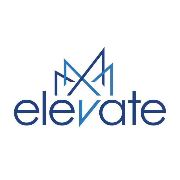
This is the final version of the design. The icon has a defined arch with arrows pointing in all directions at different heights. The wordmark is clean, well-spaced, and lines up with the movement of the icon.
